

Carpet
- CMYK
- 78, 6, 48, 0
- RGB
- 0, 174, 156
- HEX
- #00ae9c
- PANTONE
- 326 C
- RGB
- 0, 163, 147
- HEX
- #00a393
No matter where you're coming from or where you're going, when you're at PDX, you're Almost Home.
We show up with a simple goal every day: help you feel a little more at ease, a little more delighted, and a little more like you've wandered into a local neighborhood instead of a place built for merely passing through.
Almost Home is not a tagline; it's a promise. A feeling of belonging, comfort, and care through the highs, lows, and "I-think-I-left-my-waterbottle-at-security" moments of travel.
Everyone arrives with a different story - excitement, nerves, exhaustion, or a mix of all three. Our role is to make PDX a calm, safe, genuinely welcoming space where travelers feel cared for, not processed.
PDX feels like the Portland region because it is - friendly, creative, proudly local, and filled with surprising moments that make you smile. Our shops, food, art, music, and people all bring the quirky charm and warm community energy of the PNW straight into your travel experience.
Whether we're creating smooth, welcoming experiences for travelers or expanding economic opportunities for our region, we're committed to positive impact. Big moments, tiny details - they all matter.
You can count on us.
We are:
Clear
Specific
Helpful
Confident
We're glad you're here and want you to have an outstanding experience.
We are:
Friendly
Warm
Humble
Inclusive
We're serious about our commitment to you. Not about ourselves.
We are:
Witty
Quirky
Fun
Conversational
Design that pulls you in, and makes you feel like anything you need is right at hand.
It's not overly knowing or pointed. That'll make anyone uncomfortable.
Design that stops you in your tracks, and makes you smile.
We avoid getting overly jokey or glib. We're trying to make flights here.
Design that's familiar and helps you feel like you're a part of something. It should feel like it was made for you.
It's not overly casual or off-putting in its efforts to be friendly.
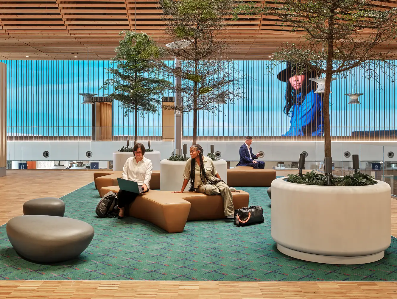
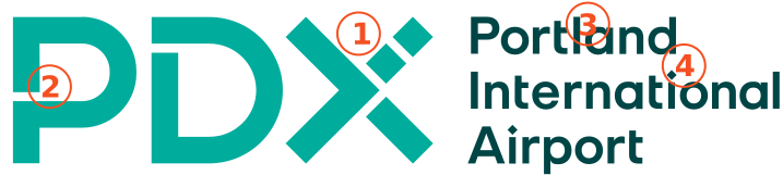
Our logo is rooted in something beloved: the iconic PDX carpet. It's a symbol travelers connect with instantly - a little slice of home under your feet. By tapping into this familiar pattern, our logo honors the grassroots love for PDX and reinforces our promise that when you're here, you're almost home.
The PDX logo nods to the airport's legendary 1987 carpet - inspired by an air traffic controller's nighttime view of the airfield - and brings that quirky, nostalgic energy right into the letters P-D-X.
It's a visual wink to the locals and a warm "welcome in" to everyone else. It carries the feeling that this place is personal, memorable, and proudly ours - a place that feels almost home from the moment you arrive.
Use this logo in everyday materials and local signage. In situations where people already know us, the simpler logo works.
The expanded PDX logo is our "big hello."
Use it when we're introducing ourselves to people who might not recognize the shorthand - international campaigns, conferences, and high-visibility moments where clarity matters.
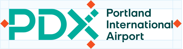
This diagram shows the formula for creating the minimum margin of space around our logo.
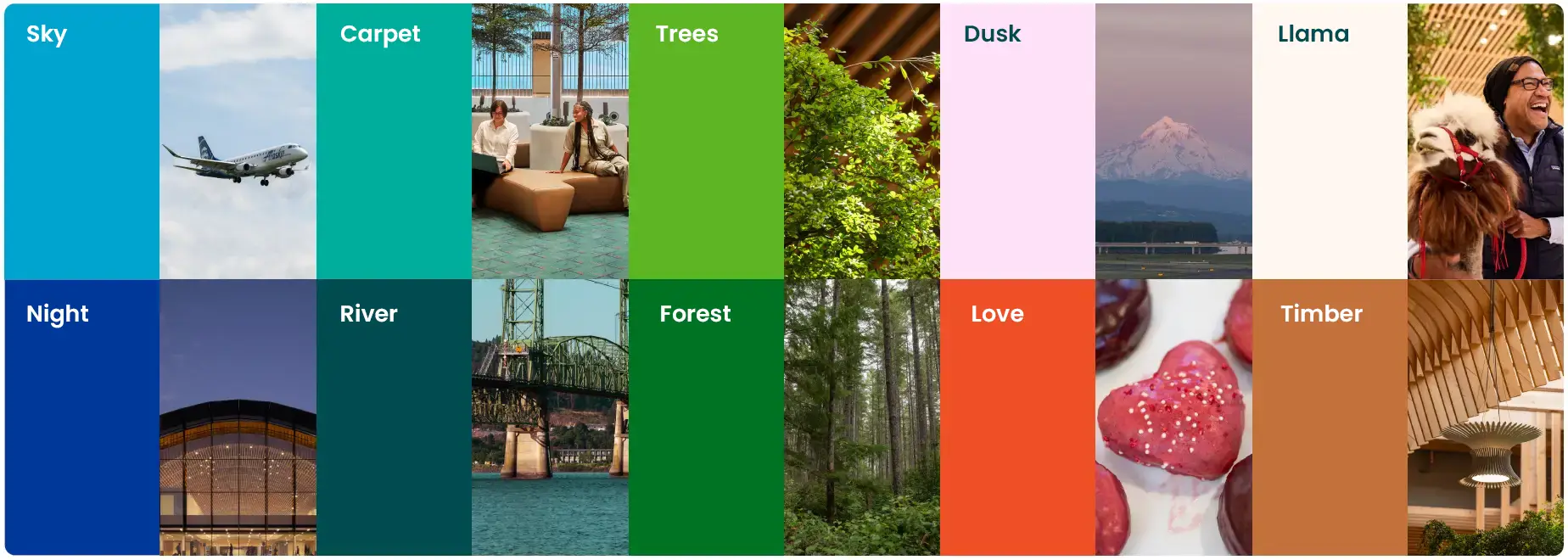
Our color palette reflects the energy of the region we call home - intuitive, playful, and rooted in the landscapes, textures, and moods that make the PNW feel like the PNW. These colors help us show up with warmth and personality, bringing a sense of familiarity to every touchpoint.
These colors are inspired by the world around us - forest trails, river mornings, big gray skies, glowing neon signs, and those surprise pops of brightness that make Portland feel creative and alive.
Our core colors form the foundation of the PDX brand - simple, flexible, and unmistakably us. They balance clarity with warmth, giving every piece of communication a sense of place and personality.
Our type system is built with clarity and accessibility at its core, but still carries a little of that PDX spark - a friendly tone, a hint of personality, and a style that has a human touch.
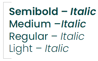
Poppins is our primary font for internal use, mainly for documents such as presentations and newsletters.
Primary Weight
Poppins Bold
Other Core Weights
Full Alphabet
Inter is our preferred body copy typeface for both screens and digital. In situations where Inter is not available, Arial is a viable substitute.
Primary Weight
Full Alphabet
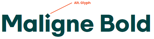
Maligne is our main display font for PDX. For headlines, use the alternative glyphs for "i" and "J" and all punctuation; for smaller text, use the standard glyphs.
Note: Font name is pronounced mah-LEEN, rhymes with "clean".
Primary Weight
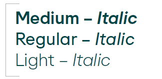
Other Core Weights
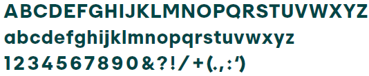
Full Alphabet
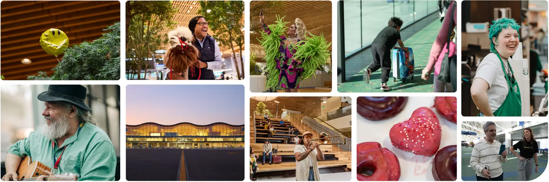
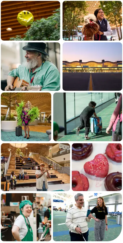
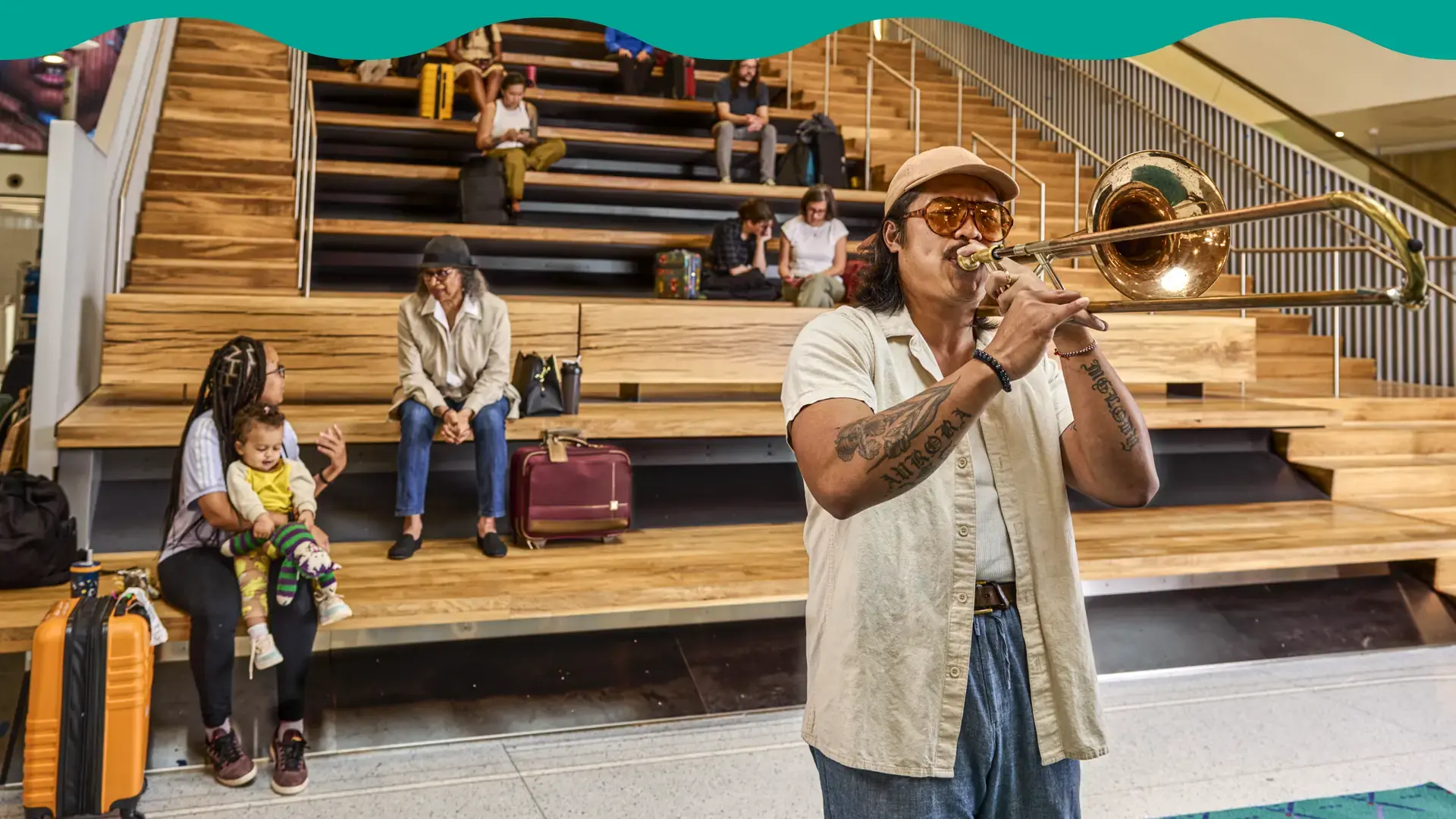
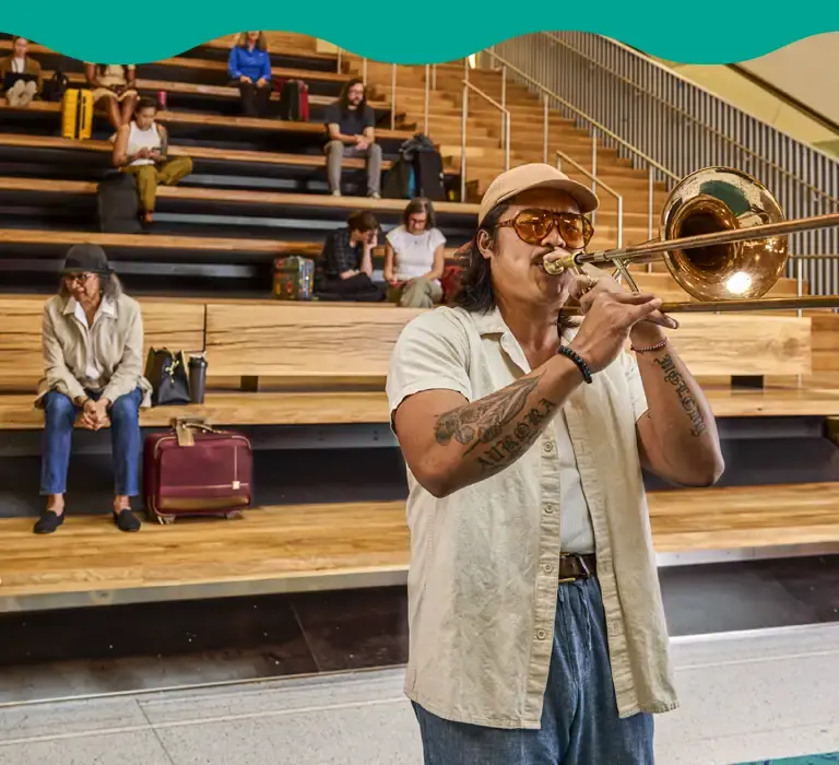
Our photography captures authentic, everyday moments - real travelers, real staff, real connections - along with the natural beauty and personality of our region. The smiles, the reunions, the deep breaths, the local flavor - the moments that feel like home.
At PDX, people are at the heart of everything, and our photography reflects that. Our approach is candid, warm, and rooted in real life. We aim to capture the full spectrum of our community across age, ability, identity, and lived experience. If someone can look at our photos and think, "Hey, that feels like a place for me," then we're doing it right.
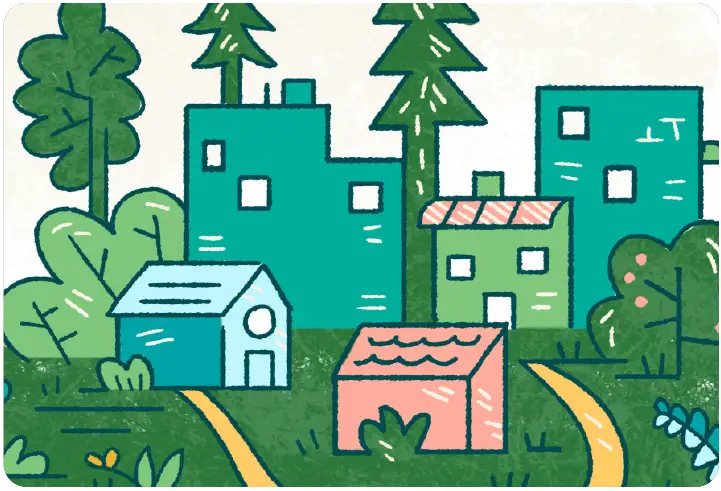
Our illustrations bring the region's character, charm and gentle weirdness to life. They help us show (not just tell) what makes PDX feel welcoming, delightful, and distinctly local. We tap into the creativity of our PNW artist community because nobody captures "home" quite like the people who live here.
Our illustrations should feel warm, inviting, and a little unexpected - playful enough to bring a smile, but grounded enough to support clear communication. Every illustration should carry that sense of "Oh, that feels like PDX".
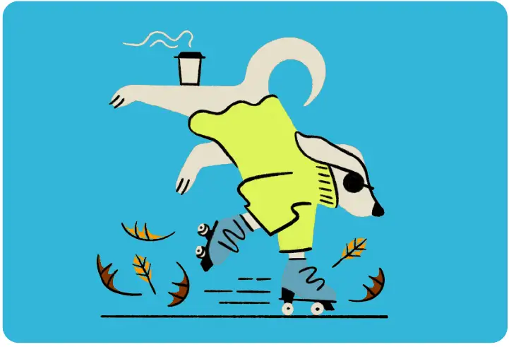
Our characters exist to spark delight. They keep things simple, expressive, and a touch quirky - whether they're showing where to relax, grab a bite, shop local, or discover a hidden gem in the terminal.
Artist: Jolby
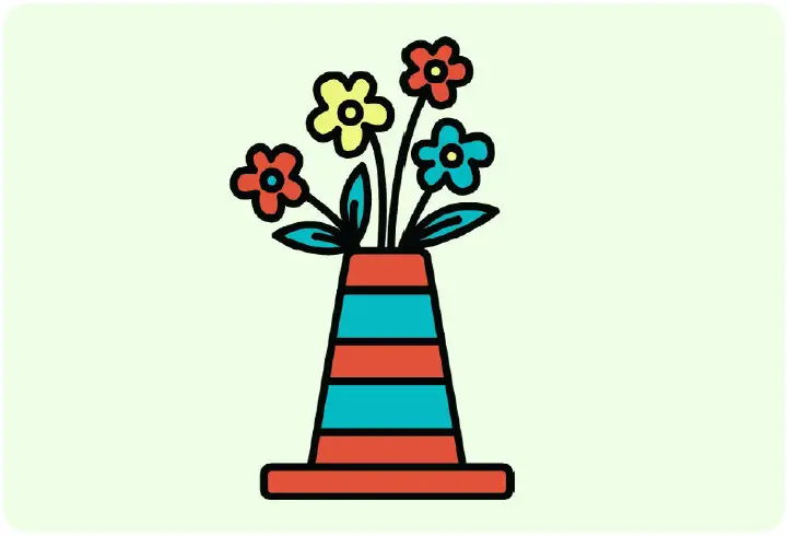
Illustrations should use colors from the PDX palette whenever possible - not just for consistency, but because these colors reflect the region's mood and energy.
Artist: Jolby
A little cleverness goes a long way. Our illustrations can include small humorous details or delightful surprises - the kind that make someone pause, grin, or show a friend.
Artist: Vee Chenting Qian
Our line work should feel hand-drawn and doodle-like - organic, loose, and human. It adds levity, warmth, and an approachable vibe that matches the tone of our copy.
Artist: Chandler Subra